Subscription Plan Strategy

Led the creation of a subscription strategy for a unified product suite


AI stack
Claude, ChatGPT, Figma MCP
Who I worked with
Leadership team, research agency, UX Researcher
Who was impacted
The business and users
decorative image


OBJECTIVE

Lead the go-to-market subscription strategy that would bring two companies and three financial products together under one cohesive offering.


The Problem

In 2026, Till Financial, a fintech startup offering debit cards for teens, was acquired by Western & Southern, the parent company of Fabric. As part of the acquisition, Fabric and Till were being brought together under one brand, with a unified product suite spanning three offerings:

  • Kids Investment Account: Fabric's investment account for parents of younger children.
  • Teen Debit Card: Till's debit card for older children and teenagers.
  • Family Savings Account: A new savings product for families.

Until then, each product had its own pricing model and target audience:

Product Target Audience Existing Pricing
Kids Investment Account Parents of younger children, generally ages 0–8 $3/month for one account; $5/month for multiple accounts
Teen Debit Card Parents of older children, generally ages 8–18 Free tier; $6/month for Premium
Family Savings Account To be determined Not yet established


The opportunity was to bring these individual products together into a subscription suite that could grow with a family—from a child's birth through their teenage years and preparation for high school graduation.

But combining the products raised a fundamental question: How should we package and price products with different use cases, target audiences, and perceived value into one cohesive subscription offering?

We needed to understand what motivated parents to pay, how their needs overlapped across their children's life stages, and how they would evaluate our new offering against existing alternatives.


Defining the Research Questions

I was the lead on this subscription strategy effort, which would create the foundation upon which the entire merged brand was built. I worked with the Till COO and the GTM lead to identify four key questions that we needed to answer before committing to a subscription strategy:

  1. What motivates parents? Were the underlying needs of parents with younger children meaningfully different from those of parents with teenagers? If their motivations didn't overlap, we might need to rethink the premise of a unified subscription model.
  2. What tools do parents use today? What existing financial products and services were they using, and what did they like or dislike about them?
  3. Did our product suite resonate? Would parents find the combined offering compelling, and which products or features were most valuable to them?
  4. How did parents evaluate pricing? How did our proposed subscription plans compare with competitors, and what would make parents willing to pay?


These questions would guide our research and help us move beyond internal assumptions to a subscription strategy grounded in customer needs.

Initial Research: Establishing a Shared Foundation

With Fabric and Till just beginning to come together, we wanted an independent perspective to help us understand this combined customer base. We engaged a research agency to conduct the initial research, drawing on my experience leading Research at Fabric to help structure the testing and ensure we were asking the right questions.

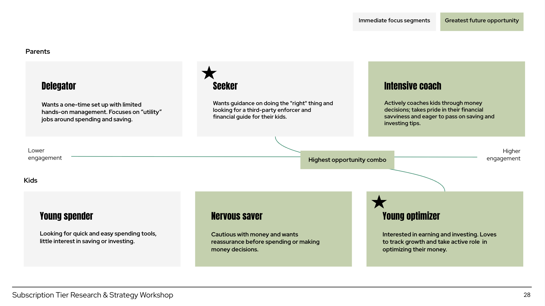
The agency conducted focus groups and presented its findings at an in-person workshop with company leadership. The research established a shared understanding of the audience, introducing three parent personas and three child personas, and identifying the combinations that represented our most promising target customers.


Agency personas
Parent and child personas presented by the research agency

The agency also proposed two approaches to subscription packaging, each based on a different way of understanding customer needs:

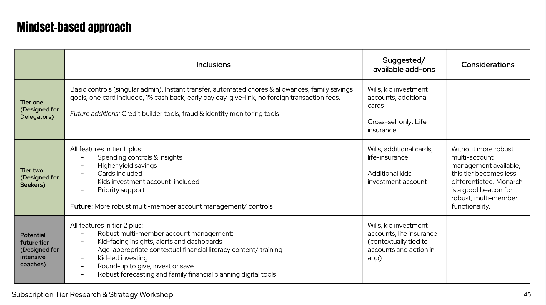
  • Mindset (goals-based): Organize subscription plans around what parents wanted to accomplish, regardless of their child's age.
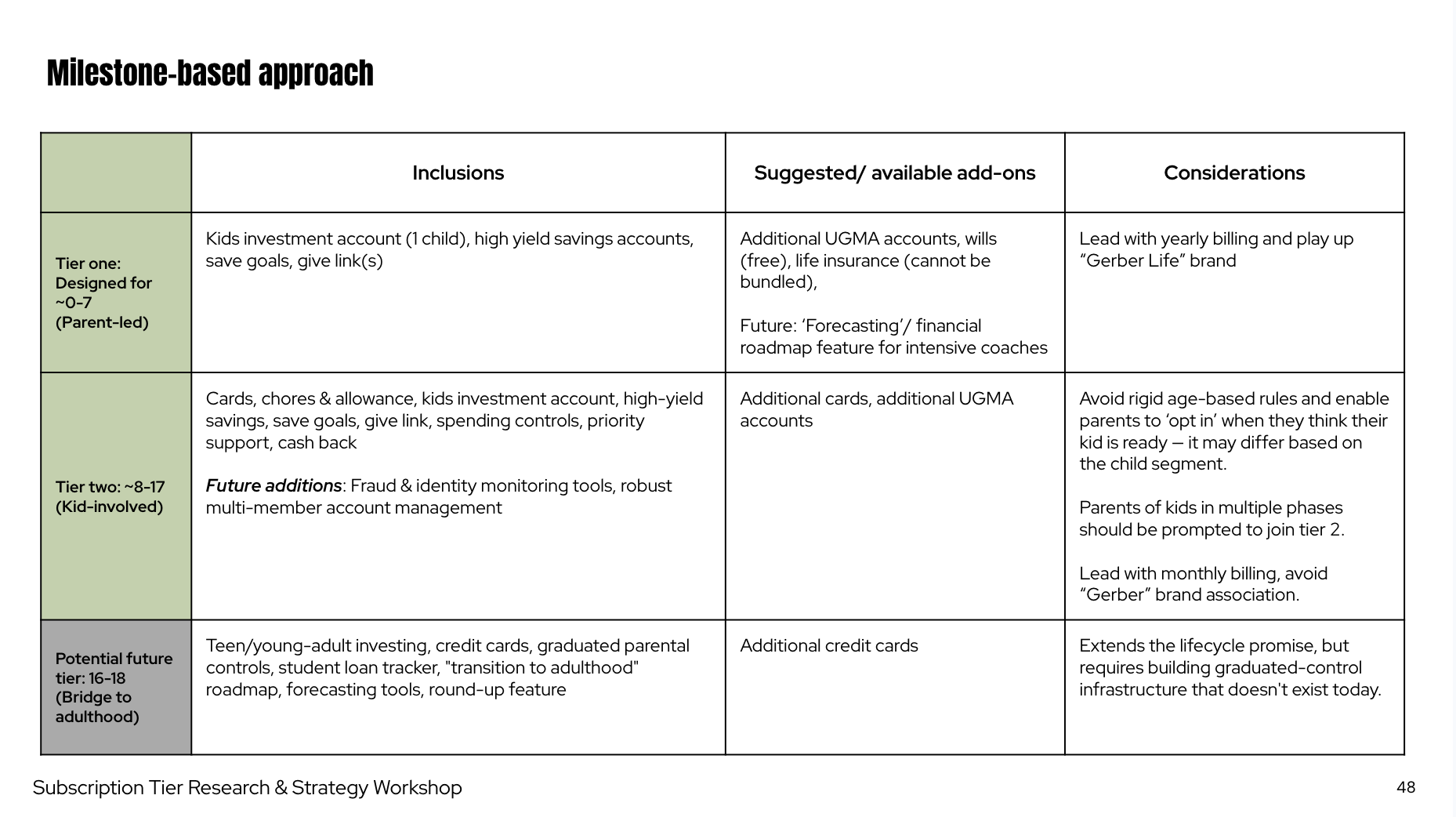
  • Milestone: Organize plans around a child's age and life stage, reflecting how their financial needs evolve as they grow.


Agency Mindset recommendation
Agency Milestones recommendation

The agency presented two distinct approaches to subscription packaging: Mindset v. Milestone


The agency recommended the Milestone approach.

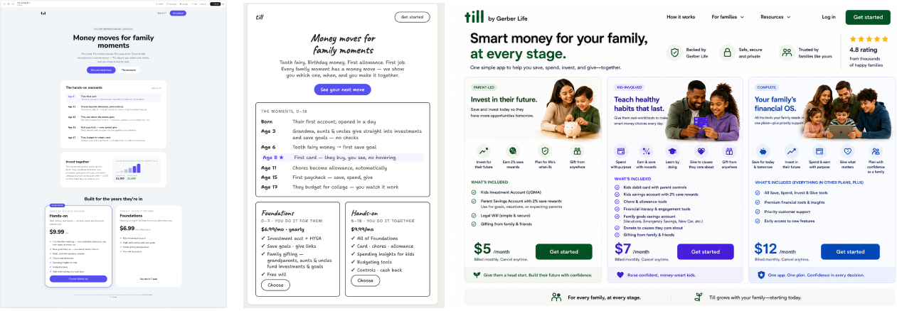
Using the personas and research findings as a foundation, the leadership team workshopped different subscription structures. We explored variations using sticky notes and AI tools, including Claude, ChatGPT, and Figma MCP, to quickly generate and visualize potential plans.


AI-generated subscription plan mocks
The team used a variety of AI tools (Claude, ChatGPT, Figma MCP) to generate and visualize potential subscription plans

The exercise gave us a range of directions to consider, but it also exposed a key disagreement: Should we organize our subscription around what parents want to accomplish or where their children are in life?

Refinement: Letting User Research Break the Tie

While the initial research established a shared vocabulary and helped us understand the audience, it hadn't fully resolved the debate. Some stakeholders favored the Mindset (goals-based) plan, while others—including me—leaned toward the Milestone plan.

Rather than letting internal preferences determine the outcome, I wanted us to identify the approach that would resonate most with users.

With the agency engagement complete, I partnered with my UX Researcher to validate the remaining assumptions. I worked with our COO and GTM lead to identify the most important unanswered questions, then collaborated with my researcher to design a follow-up user test.

Across three rounds of testing, we uncovered several insights that materially shaped the subscription structure:


1. Age helped parents choose, but wasn't enough on its own

Including a child's age helped parents identify the plan most relevant to their family. However, parents still wanted to understand what each plan would actually help them do.

The implication: Age could provide useful guidance, but the plans also needed to communicate the tangible jobs and needs they addressed. (So it turned out that both the Mindset and the Milestone camps were correct!)


2. Parents expected subscription tiers to build on one another

Users were accustomed to a familiar subscription pattern: each successive tier offered everything in the previous tier, plus additional features or value.

The Milestone approach challenged that expectation. Its first two plans were essentially parallel offerings, each designed for a different age group rather than representing progressively greater value.

The implication: We needed to balance the relevance of age-based packaging with the clarity of a conventional tiered subscription model.


3. The combined offering was more compelling than any single product

The most compelling option was the all-inclusive plan, followed by the plan featuring the Kids Investment Account, and then the Teen Debit Card plan.

More importantly, parents who were interested in the Teen Debit Card were especially likely to want to upgrade to the all-inclusive plan.

This revealed an important upsell opportunity. Parents could open an investment account for a younger child at almost any stage, but the debit card was relevant primarily to parents of older children. For those parents, the opportunity to combine a teen debit card with an investment account was particularly compelling.

The implication: The value of the combined subscription extended beyond giving parents access to multiple products. The products complemented one another, creating a more compelling proposition for families at different life stages.


4. Perceived value mattered more than price

While our Data team led the unit economics analysis, I led the user research to evaluate different pricing options and understand how parents assessed the value of our subscription.

We found that users didn't have a specific price point in mind. Instead, their willingness to pay was driven by the value they perceived they were getting. As long as our pricing was within a reasonable range of key competitors, a difference of a few dollars mattered less than whether the offering felt worth the cost.

Users also appreciated the simplicity of our age-based subscription structure. Compared with competitors' often overwhelming mix of features and tiers, our plans made it easier for parents to understand their options and identify which plan best fit their family. They generally viewed our pricing as reasonable, although they also identified gaps in the offering, including the lack of family sharing (which was already on our Product roadmap).

The implication: We couldn't win on price alone. We needed to make the value of each plan immediately clear, maintain a competitive price point, and prioritize features that would make the subscription more compelling. The findings also reinforced the value of a straightforward, age-based structure that helped parents navigate their options without the complexity of competing offerings.

Translating Research into a Subscription Structure

The research helped us move beyond the initial debate between Mindset and Milestone. We learned that parents valued the relevance of an age-based approach, but still expected a familiar tiered structure and a clear explanation of what each plan offered. We also uncovered an opportunity to position the full product suite as a more compelling proposition than any individual product alone.

Using these findings, we landed on a final subscription structure that brought the three products together into a cohesive offering designed to serve families as their children grew.

Explore the interactive Till product page prototype below (built in Claude) to see how we translated the subscription structure into a clear and compelling customer experience. Final marketing page is in progress—coming soon.

For the in-app design process, see the Subscription Plan In-App Design case study.


Till product page prototype built in Claude — scroll and click around to explore